
With React, you can create dynamic and interactive web applications efficiently. To expedite the development process and enhance the overall user experience, developers often rely on UI libraries that provide pre-built components, styles, and utilities. In this article, we will explore some of the top React UI libraries available today.
Table of Contents
- 1. Material-UI
- 2. Ant Design
- 3. Tailwind CSS
- 4. Semantic UI React
- 5. Chakra UI
- 6. Mantine
- 7. Carbon Design System
1. Material-UI

Material-UI is one of the most widely used React UI libraries. It is built upon Google’s Material Design guidelines and provides a comprehensive set of well-designed and customizable components. Material-UI offers a rich collection of UI elements, including buttons, forms, navigation, and more. The library follows a modular approach, allowing developers to selectively import only the components they need, minimizing the bundle size. MUI’s components are available for Android, iOS, Flutter, and the Web.
With Material-UI, developers can easily create beautiful and responsive interfaces. The library also supports server-side rendering and has excellent documentation and an active community. Material-UI’s popularity is further amplified by its integration with other popular libraries and frameworks, such as Redux and Next.js. It is also a great choice for enterprise applications.
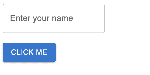
There are many MUI components to utilize. In this brief example, you will see possible usage for the <Button> and <TextField> components MUI provides.
import React from 'react';
import { Button, TextField } from '@material-ui/core';

const App = () => {
  return (
    <div>
      <TextField label="Enter your name" />
      <br/>
      <br/>
      <Button variant="contained" color="primary">
        Click me
      </Button>
    </div>
  );
};

export default App;
Output:
2. Ant Design
Ant Design is a popular React UI library that offers a wide range of high-quality components following the principles of the Ant Design specification. Ant Design provides a rich set of components for building elegant and professional-looking applications.
The library comes with an extensive set of icons, layout components, form elements, and navigation elements. Ant Design also offers internationalization support and a customizable theming system. It has a strong focus on accessibility and provides excellent documentation and community support. Like MUI, Ant Design is also a great choice for enterprise applications.
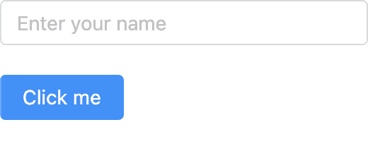
Example from above implemented using Ant Design:
import React from 'react';
import { Button, Input } from 'antd';

const App = () => {
  return (
    <div>
      <Input placeholder="Enter your name" />
      <br/>
      <br/>
      <Button type="primary">Click me</Button>
    </div>
  );
};

export default App;
Output:
3. Tailwind CSS

Tailwind CSS is primarily a utility-first CSS framework and it provides a set of pre-built CSS classes that can be used to style HTML elements and create responsive layouts. It offers excellent integration with React. With Tailwind CSS, developers can rapidly prototype and build interfaces by leveraging the utility classes instead of writing custom CSS.
Tailwind CSS encourages a highly customizable approach, allowing developers to fine-tune the visual appearance of their applications. By combining Tailwind CSS with React, developers can create flexible and visually stunning UIs. However, compared to other libraries on this list, Tailwind CSS requires more manual configuration and styling.
Previous example with Tailwind:
import React from 'react';

const App = () => {
  return (
    <div>
      <input
        className="border border-gray-400 rounded py-2 px-4"
        type="text"
        placeholder="Enter your name"
      />
      <br/>
      <br/>
      <button className="bg-blue-500 hover:bg-blue-700 text-white font-bold py-2 px-4 rounded">
        Click me
      </button>
    </div>
  );
};

export default App;
4. Semantic UI React

Semantic UI React is a popular library that brings the expressive power of Semantic UI to React applications. Semantic UI provides a set of intuitive and human-friendly class names to style HTML elements, making it easier to create visually appealing interfaces.
Semantic UI React offers a wide range of components, including buttons, grids, forms, modals, and much more. The library is well-documented and provides a consistent and easy-to-use API. With Semantic UI React, developers can quickly prototype and build applications with a clean and modern design.
Example:
import React from 'react';
import { Button, Input } from 'semantic-ui-react';

const App = () => {
  return (
    <div>
      <Input placeholder="Enter your name" />
      <br/>
      <br/>
      <Button primary>Click me</Button>
    </div>
  );
};

export default App;
5. Chakra UI

Chakra UI is a highly customizable React UI library that emphasizes accessibility and developer experience. It provides a set of accessible and reusable components that follow modern design principles. Chakra UI also offers a theming system that allows developers to customize the design and behavior of components to match their application’s requirements.
The library’s components are designed to be composable, making it easy to build complex UIs by combining simple components. Chakra UI also provides hooks and utilities for handling common use cases, such as managing forms and responsive layouts. With its focus on accessibility and developer-friendly APIs, Chakra UI is a powerful choice for building inclusive and user-friendly applications.
Example:
import React from 'react';
import { Button, Input } from '@chakra-ui/react';

const App = () => {
  return (
    <div>
      <Input placeholder="Enter your name" />
      <br/>
      <br/>
      <Button colorScheme="blue">Click me</Button>
    </div>
  );
};

export default App;
6. Mantine

Mantine is a modern and lightweight React UI library that has gained popularity for its simplicity, performance, and accessibility-focused approach. With Mantine, developers can easily create high-quality web applications with a collection of customizable and responsive components.
The library emphasizes accessibility by adhering to best practices for keyboard navigation and ARIA labels, making it an inclusive choice for all users. Mantine’s theming system allows developers to customize the styling of components to match their application’s design requirements. Additionally, Mantine provides a set of developer-friendly APIs and hooks, simplifying common tasks and speeding up development.
Example:
import React from 'react';
import { Button, TextInput } from '@mantine/core';

const App = () => {
  return (
    <div>
      <TextInput label="Name" placeholder="Enter your name" />
      <br/>
      <br/>
      <Button color="blue" size="large">
        Click me
      </Button>
    </div>
  );
};

export default App;
7. Carbon Design System

The Carbon Design System for React is a UI library developed by IBM. It provides a set of reusable components and guidelines for building enterprise-level applications. Carbon follows IBM’s design principles and offers a consistent and scalable UI toolkit.
Carbon Design System includes components for navigation, forms, data visualization, and more. The library also provides a theming system and supports internationalization. With Carbon, developers can create visually stunning and accessible interfaces while adhering to enterprise design standards.
Example:
import React from 'react';
import { Button, TextInput } from 'carbon-components-react';

const App = () => {
  return (
    <div>
      <TextInput labelText="Name" placeholder="Enter your name" />
      <br/>
      <br/>
      <Button kind="primary">Click me</Button>
    </div>
  );
};

export default App;