
React provides developers with the power to create dynamic user interfaces with ease. However, integrating notification systems into React applications can be challenging, especially when you want to provide users with quick feedback about their actions or important updates. This is where React Toastify comes in.
React Toastify is a flexible and customizable notification library that simplifies the process of displaying unobtrusive and user-friendly toast notifications in React applications. In this in-depth blog post, we will explore the features, options, and more that React Toastify has to offer.
Table of Contents
- 1. What is React Toastify?
- 2. Installation
- 3. Basic Usage
- 4. Customizing Toasts
- 5. Positioning Toasts
- 6. Animation and Transition
- 7. Timeout and AutoClose
- 8. Advanced Configuration Options
- 9. Best Practices
- Conclusion
1. What is React Toastify?
React Toastify is a lightweight and user-friendly toast notification library for React applications. It allows developers to display temporary messages, alerts, or notifications to users in a non-intrusive way. These toast notifications appear at the top or bottom of the screen and automatically disappear after a certain duration.
The library offers a wide range of features, such as customizable toast components, various positioning options, smooth animations, event handling, and much more. With React Toastify, you can quickly enhance the user experience of your React application by providing feedback or important updates without interrupting the user flow.
Visit the React Toastify demo playground to get a hands-on feel for all it has to offer.
2. Installation
To get started with React Toastify, you need to install it as a dependency in your React project. You can do this using npm or yarn. Open your terminal and run the following command:
npm install react-toastifyor
yarn add react-toastify3. Basic Usage
Using React Toastify is straightforward. To display a basic toast notification, follow these steps:
Step 1: Import React Toastify
First, you need to import the required components from the react-toastify library.
import { toast, ToastContainer } from 'react-toastify';
import 'react-toastify/dist/ReactToastify.css';
Step 2: Display a Toast
Next, you can trigger a toast notification by calling the toast function.
const notify = () => {
  toast('Hello, this is a basic toast!');
};

// In your component:
<button onClick={notify}>Show Toast</button>
Step 3: Render ToastContainer
Finally, don’t forget to include the ToastContainer component in your application’s root level to render the toast notifications.
const App = () => {
return (
<div>
{/* Your application components */}
<ToastContainer />
</div>
);
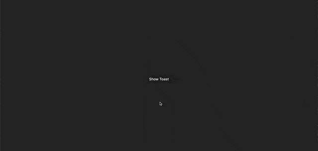
};Now, when you click the “Show Toast” button, a simple toast notification will appear at the top-right corner of your application.
Full Example in App Component
import { toast, ToastContainer } from 'react-toastify';
import 'react-toastify/dist/ReactToastify.css';

const notify = () => {
  toast('Hello, this is a basic toast!');
};

function App() {
  return (
    <div>
      <ToastContainer />
      <button onClick={notify}>Show Toast</button>
    </div>
  )
}
Result
4. Customizing Toasts
While the basic toast looks fine, you may want to customize the appearance and behavior of the toast notifications to match your application’s design and requirements. React Toastify provides several ways to achieve this level of customization.
Customizing Content
You can easily customize the content of the toast by providing your own JSX element as the content.
const CustomToast = () => (
  <div>
    <span role="img" aria-label="emoji">
      🚀
    </span>
      This is a custom toast with an emoji!
  </div>
);

// Usage:
const notifyCustom = () => {
  toast(<CustomToast />);
};
Styling Toasts
To style the toast, you can add custom CSS to the ToastContainer and Toast components. This gives you the flexibility to change the background color, text color, fonts, and more.
/* Custom styles for the toast container */
.Toastify__toast-container {
  /* Your styles here */
}

/* Custom styles for the toast itself */
.Toastify__toast {
  /* Your styles here */
}
Customizing Icon
You can also change the default icon that appears on the left side of the toast.
const notifyCustomIcon = () => {
  toast('This toast has a custom icon!', {
    icon: <CustomIcon />,
  });
};
In the example above, CustomIcon is a React component that renders the desired icon.
React Toastify also has built-in icons for notifications of different types such as success, error, and warning. See them here.
5. Positioning Toasts
React Toastify allows you to control the position of the toast notifications on the screen. By default, the toasts appear at the top-right corner, but you can easily change this to suit your application’s layout.
For example, to display the toast notifications at the top of the screen, you can set position to "top-center".
const notifyTopCenter = () => {
  toast('This is a top toast!', {
    position: "top-center",
  });
};
The available custom positions are: 'top-right', 'top-center', 'top-left', 'bottom-right', 'bottom-center', and 'bottom-left'.
6. Animation and Transition
React Toastify provides smooth and customizable animations for toast notifications. You can control the entry and exit animations using the transition option. React Toastify provides four built-in transitions namely: Bounce, Slide, Zoom, and Flip. The default is the Bounce animation.
Importing Toast Animations
import { Slide, Zoom, Flip, Bounce } from 'react-toastify';You may only include the animation(s) you want to use in the import statement.
Adding Transition to Toast
You may change the default transition of a single toast by doing the following:
import { Slide } from 'react-toastify';

const notifySlide = () => {
  toast('This toast has a fade animation!', {
    transition: Slide,
  });
};
Adding Transition to Toast Container
You can also change the transition of the ToastContainer so that the transition change applies to all toast messages.
import { Flip } from 'react-toastify';

<ToastContainer
  transition={Flip}
/>
7. Timeout and AutoClose
By default, toasts automatically disappear after a few seconds. You can control the duration using the autoClose option.
const notifyTimeout = () => {
  toast('This toast will vanish in 5 seconds!', {
    autoClose: 5000,
  });
};
Additionally, you can set the closeOnClick option to true if you want the toast to close when clicked.
const notifyCloseOnClick = () => {
  toast('Click me to close!', {
    closeOnClick: true,
  });
};
8. Advanced Configuration Options
In addition to the options mentioned above, React Toastify provides advanced configuration options that allow you to customize its behavior to a greater extent.
closeButton
You can remove the close button on the default toast by setting the closeButton option to false.
const notify = () => {
  toast('This toast does not have a close button!', {
    closeButton: false,
  });
};
draggable
To make the toast draggable, you can use the draggable option.
const notifyDraggable = () => {
  toast('This toast is draggable!', {
    draggable: true,
  });
};
hideProgressBar
By default, the toast shows a progress bar indicating the remaining time before it disappears. To hide the progress bar, set the hideProgressBar option to true.
const notifyNoProgressBar = () => {
  toast('This toast has no progress bar!', {
    hideProgressBar: true,
  });
};
pauseOnHover
To pause the autoClose timer when the user hovers over the toast, you can use the pauseOnHover option.
const notifyPauseOnHover = () => {
  toast('Pause on hover!', {
    pauseOnHover: true,
  });
};
transitionDuration
You can adjust the duration of the toast animations using the transitionDuration option.
const notifyTransitionDuration = () => {
  toast('Toast with custom transition duration!', {
    transitionDuration: 500,
  });
};
9. Best Practices
To make the most of React Toastify and create a seamless user experience, consider the following best practices:
- Use Descriptive Messages: Ensure that your toast messages convey meaningful information to the users.
- Limit Toast Duration: Keep toast durations short and informative to avoid interrupting the user’s flow.
- Position Wisely: Place toast notifications where they are least likely to obscure crucial UI elements.
- Be Consistent with Styling: Maintain a consistent style with your application’s design to provide a unified user experience.
- Opt for Subtle Animations: Use smooth and subtle animations to avoid distracting users.
- Avoid Overuse: Don’t overwhelm users with too many toast notifications. Use them judiciously for important updates only.
Conclusion
React Toastify is an excellent tool for adding toast notifications to your React applications. Its flexibility, ease of use, and customizable options make it a popular choice among developers to deliver quick feedback and important information to users.
